Going the Extra Mile — Beyond CSS
We love small finishing touches. In this article, we'll showcase a few examples where we've gone the extra mile to deliver an outstanding experience for our web and Windows users. Even if not immediately obvious, these subtle enhancements make the difference.

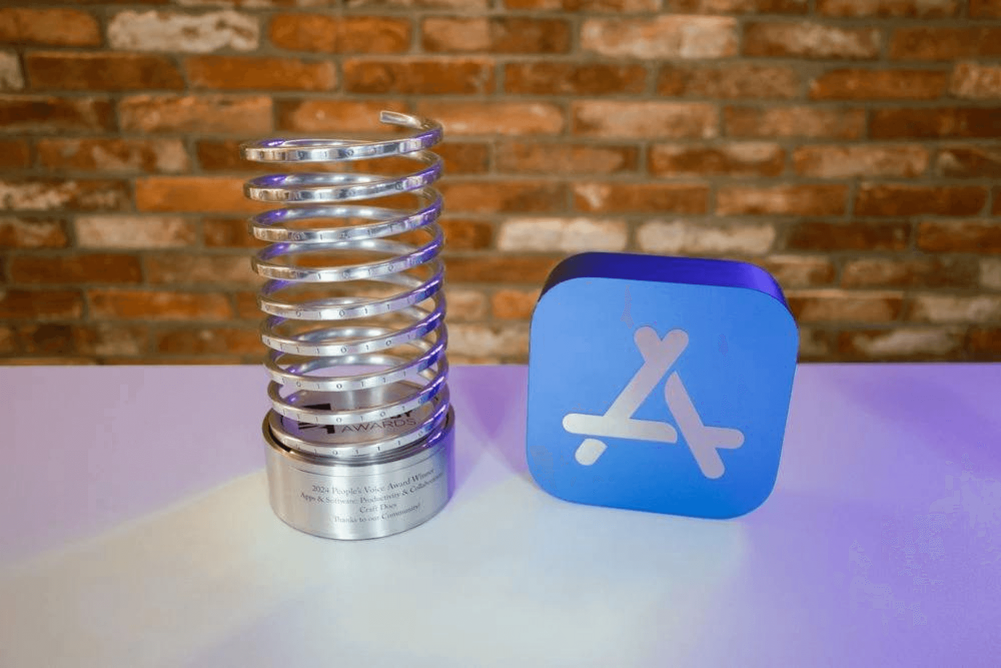
Here at Craft, we pride ourselves on creating beautiful and polished experiences. And not without recognition — we were awarded Apple's Mac App of the Year for our Mac app; but it doesn't stop there as we love going the extra mile on the web — which has its own set of challenges — earning us the Webby Award.
Checking off the first boxes
Supporting devices in the web world is complicated... we have lots of platforms to cover (Windows, Mac, iOS, Android, to name a few) and then on each one of those, we need to support multiple browsers (Chrome, Safari, Firefox). This can prove really tricky to create pixel-perfect implementations that look great everywhere — one such case for us was a redesign of our checkboxes.
At first, the task seemed pretty trivial — implement the new designs. I received the Figma file and quickly started building it into our component library.
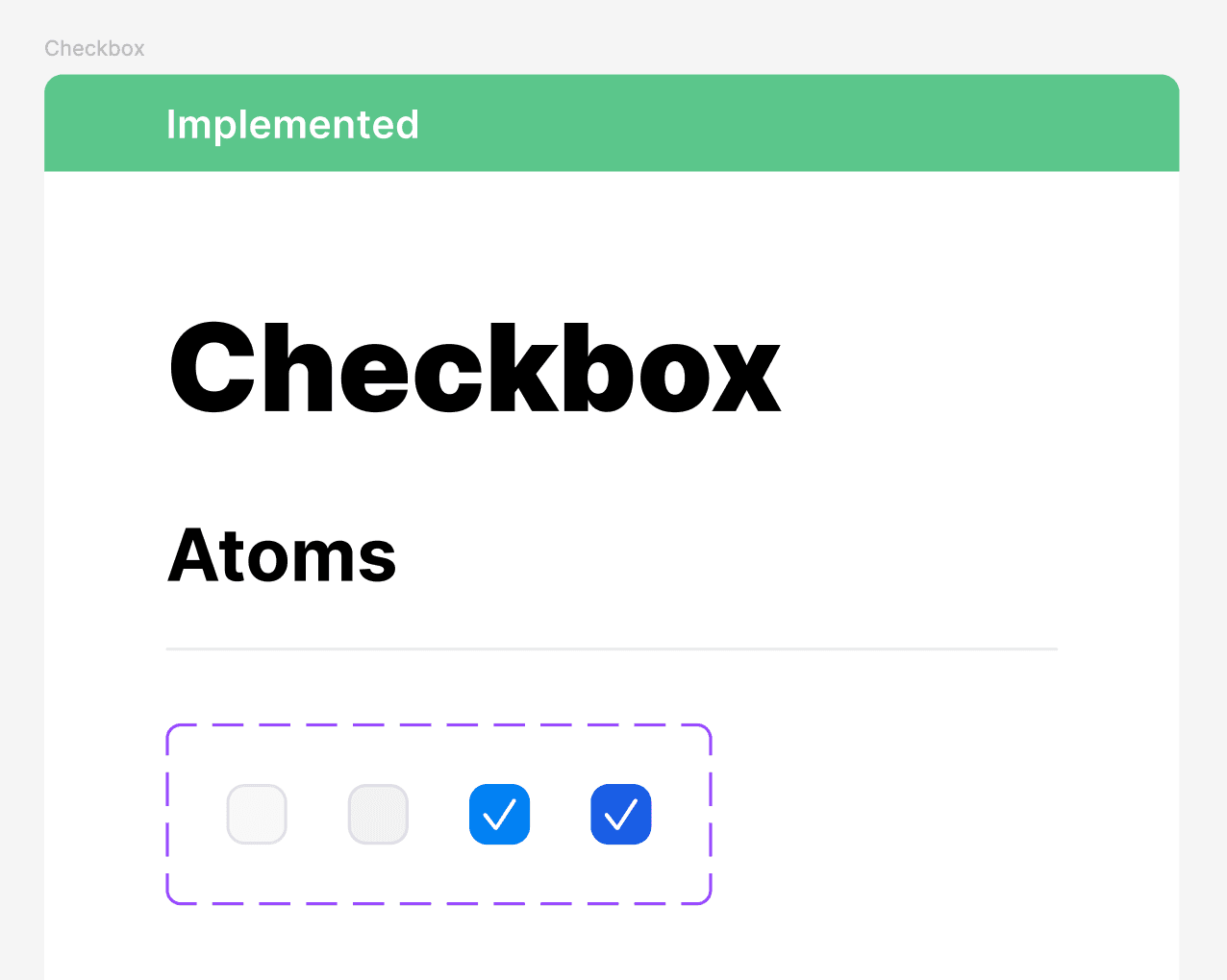
I've built the outer box using CSS, exported the checkmark icon as SVG, then put it into the code. Animation was implemented using the stroke-dasharray property.
I was pleased with the results and eagerly prepared to present them during our weekly company-wide demo session.
Problems at first sight
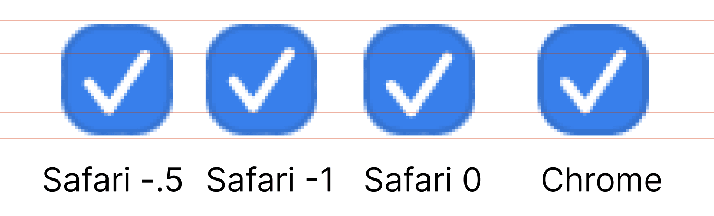
I've presented how it looks and… it couldn't have gone smoothly, if I'm writing an article about it. Bálint, our CEO and an avid Safari user, noticed that the checkboxes felt a bit misaligned. But like really a bit.
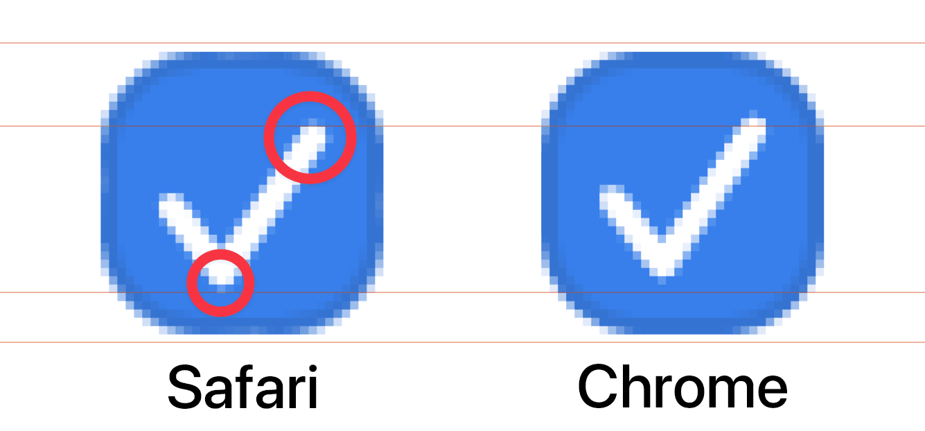
So, as mentioned before, we went the extra mile. I played around with adjusting it slightly, depending on the browser that the user had. However, it didn't cut it as we had so many different variations of browsers and on top of that different screens — it behaved completely differently on high DPI monitors than on the low DPI ones.
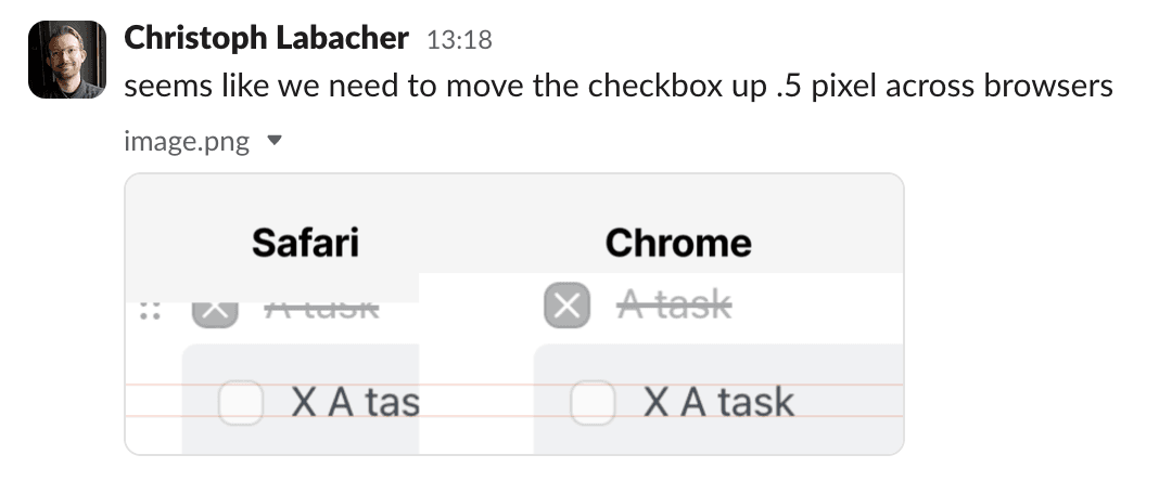
And the root cause seemed to be the difference between rendering engines of the browsers: Chrome's Chromium, Firefox's Blink, and Safari's Webkit all have slightly different rasterizing algorithms which we really couldn't do much about.
Rasterize refers to the process of converting a vector-based image or object into a raster or bitmap format. It involves converting mathematical descriptions of shapes and lines into a grid of pixels.
Don't reinvent the wheel
The next idea was to just rasterize the image once using an external app (e.g., Figma) and use the already rasterized PNG instead in code. That's something that we used in the Mac app before. Unfortunately, this approach wouldn't work here.
The goal, instead of just adding a new look, was to also add a playful animation that would give you a sense of accomplishment when you finish the task.
So… what now?
Going the hard way
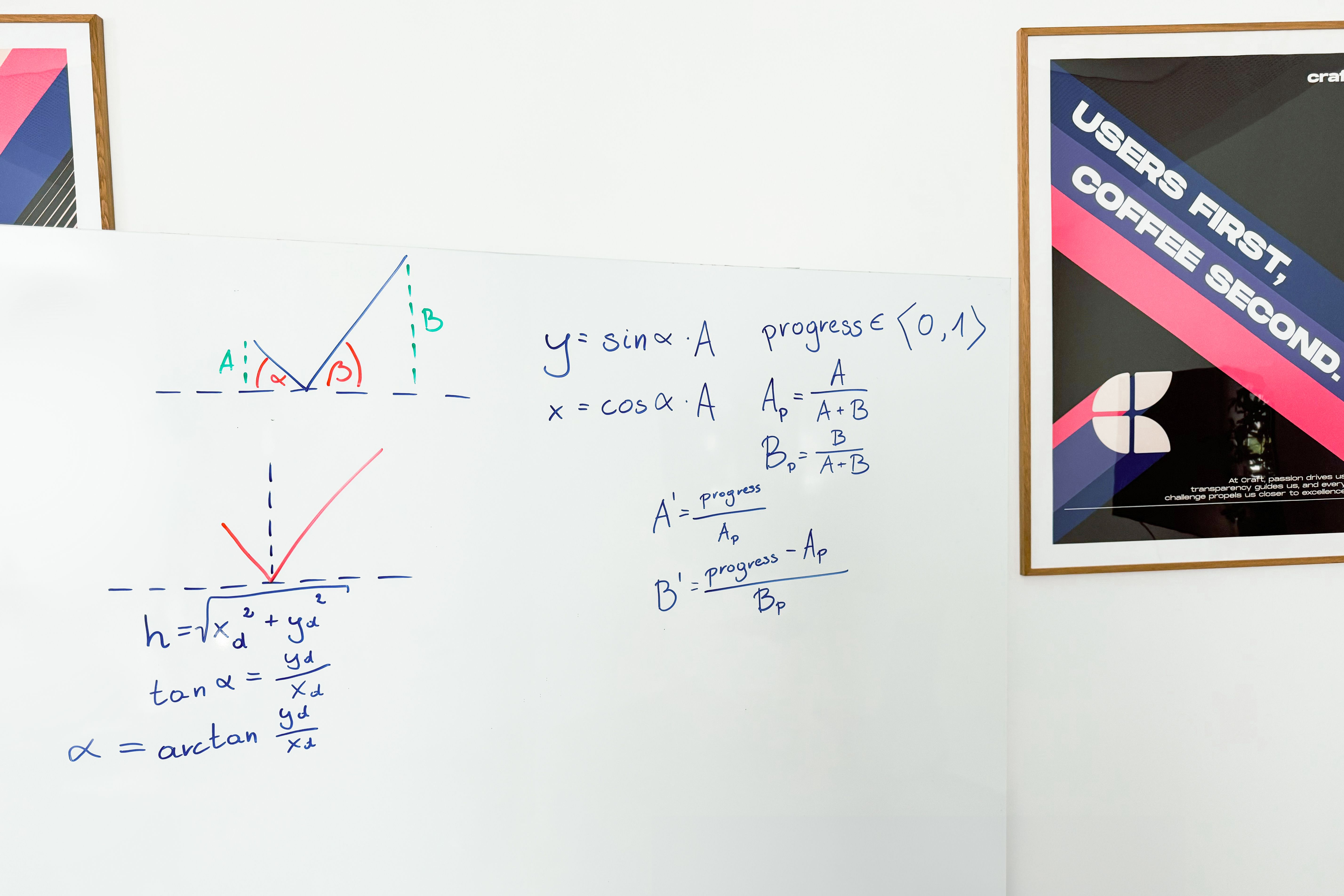
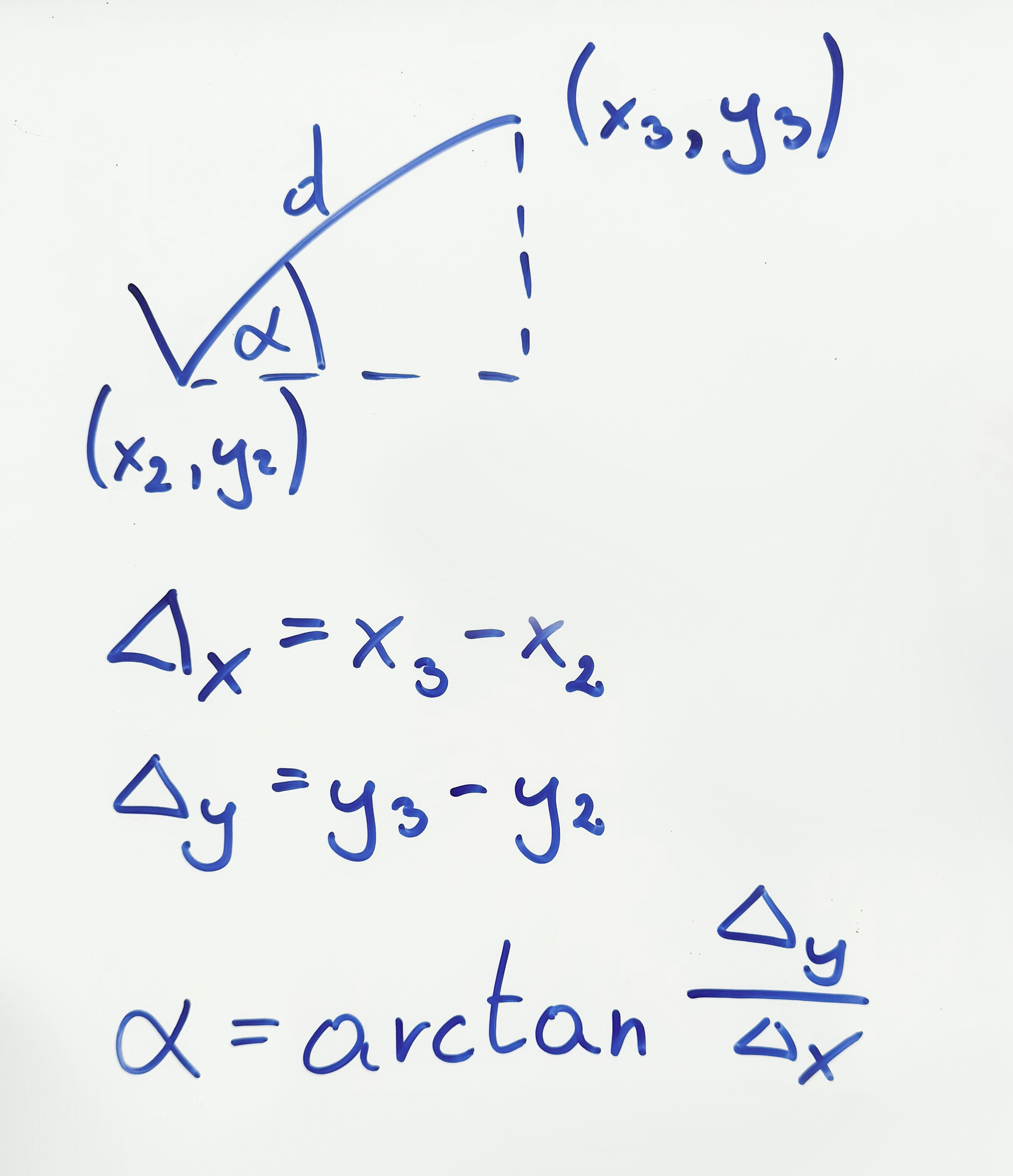
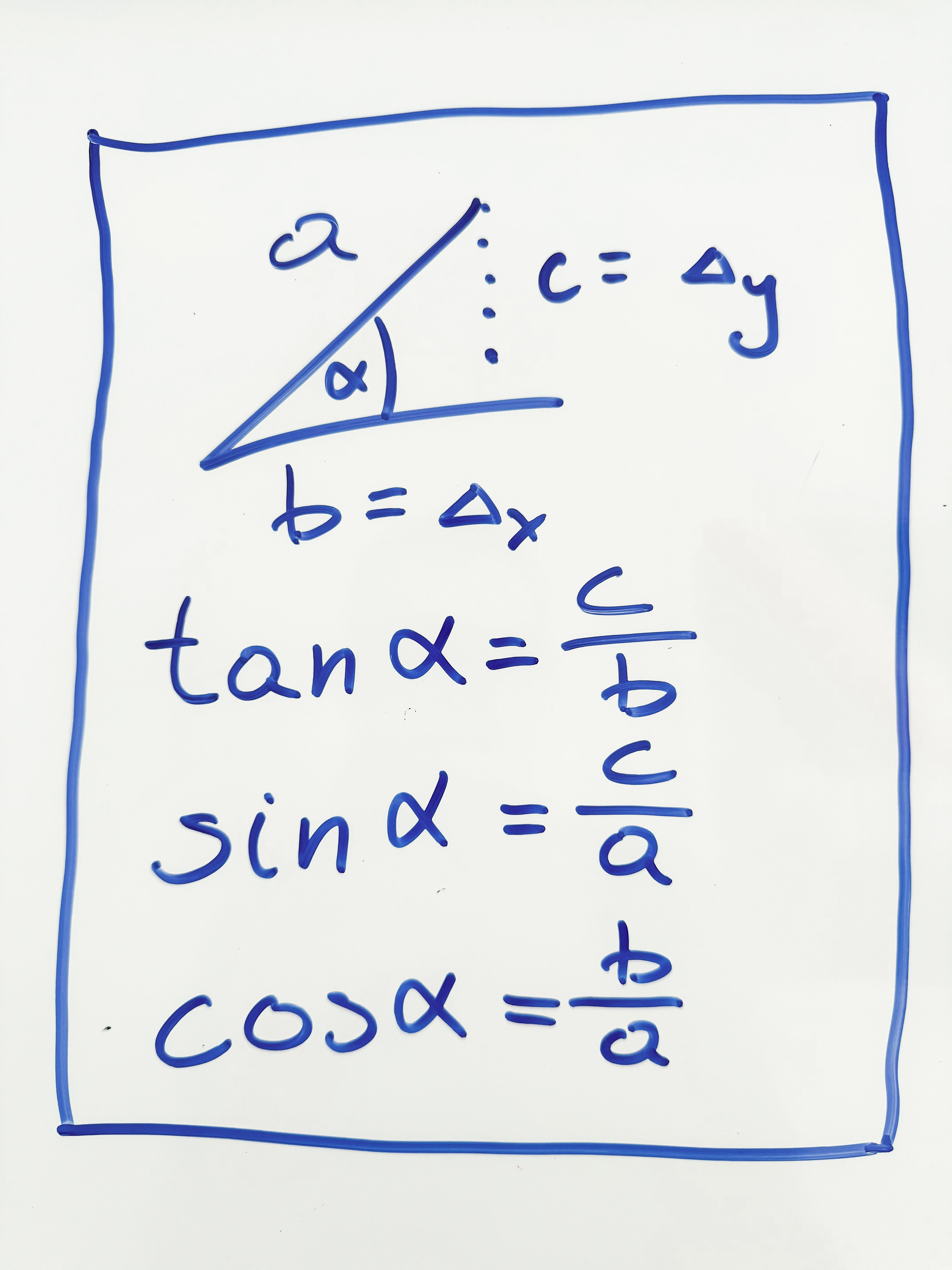
I have worked before with rendering elements using canvas. It appeared that the rendering engines there were much closer to each other. I have whipped up the good ol' SohCahToa principle and used some trigonometry to calculate how to draw the lines while being able to animate them.
Who said maths isn't useful for frontend developers?
Fortunately, the checkbox was a really easy shape to render. It needed just 2 lines.
Knowing the 3 edges of the checkbox, I was able to easily draw it statically
const $canvas = canvasRef.current
const ctx = $canvas.getContext('2d')
ctx.moveTo(x1, y1)
ctx.lineTo(x2, y2)
ctx.lineTo(x3, y3)
The tricky part was the animation — and to be more precise how to calculate the end of the line at the particular time.
Let's think about it from another point then — the checkbox is 2 lines drawn at certain angles.
So to draw them in a way that is in the animation we have to:
- Start at the top of the first line.
- Start drawing it at an angle, proportionally to the time that has passed.
- Draw it till we draw all of it.
- Start at the bottom of the second line.
- Start drawing it at an angle, proportionally to the time that has passed.
- Draw it till we draw all of it.
- The animation is done!
Let the maths prevail
If you have angles, then you can't escape the trigonometry!
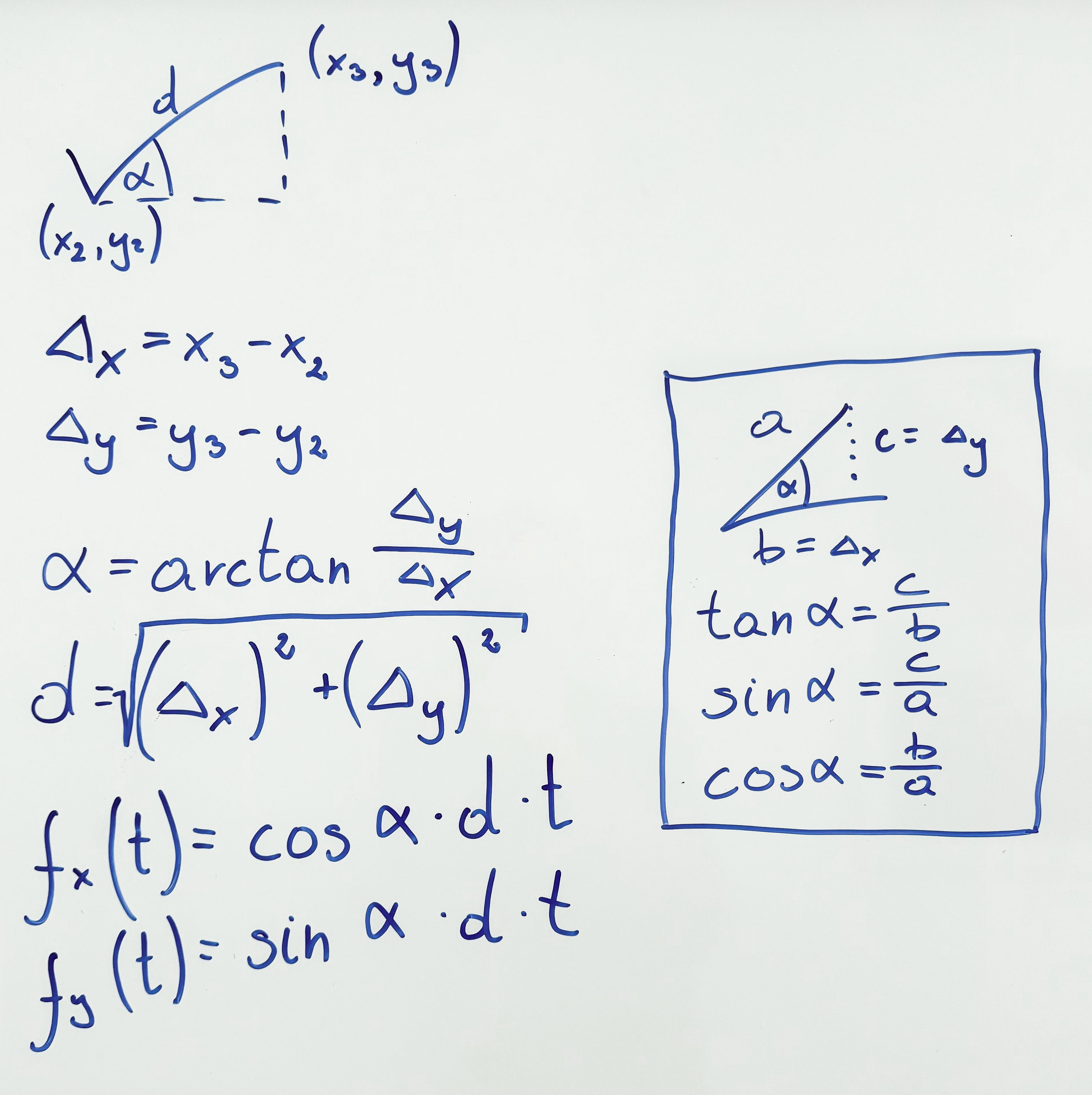
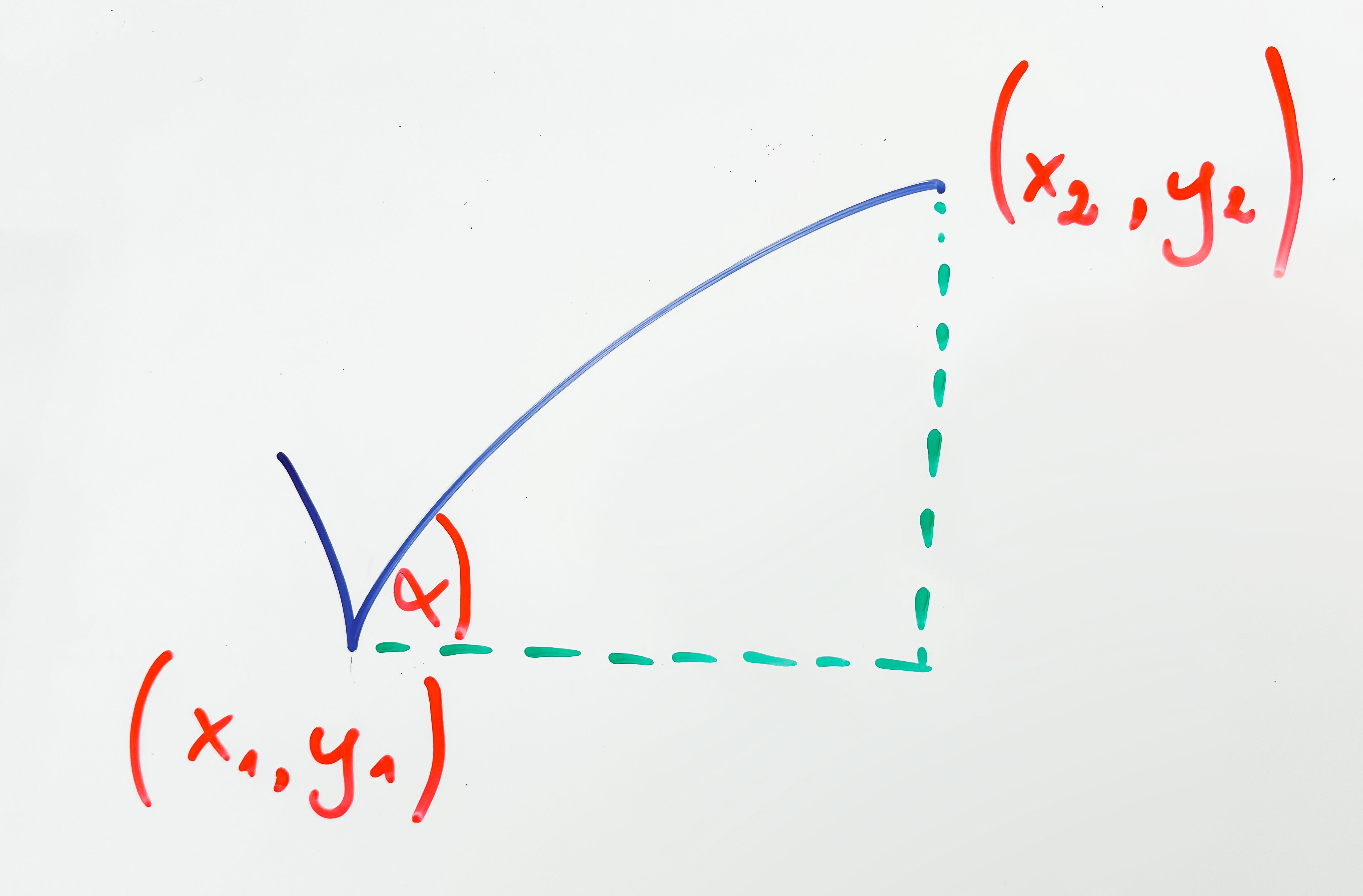
So to start off let's calculate the angles at which the lines should be drawn. Using the SohCahToa mnemonic we can calculate it based on the difference between 2 points in x and y and its arctangent.
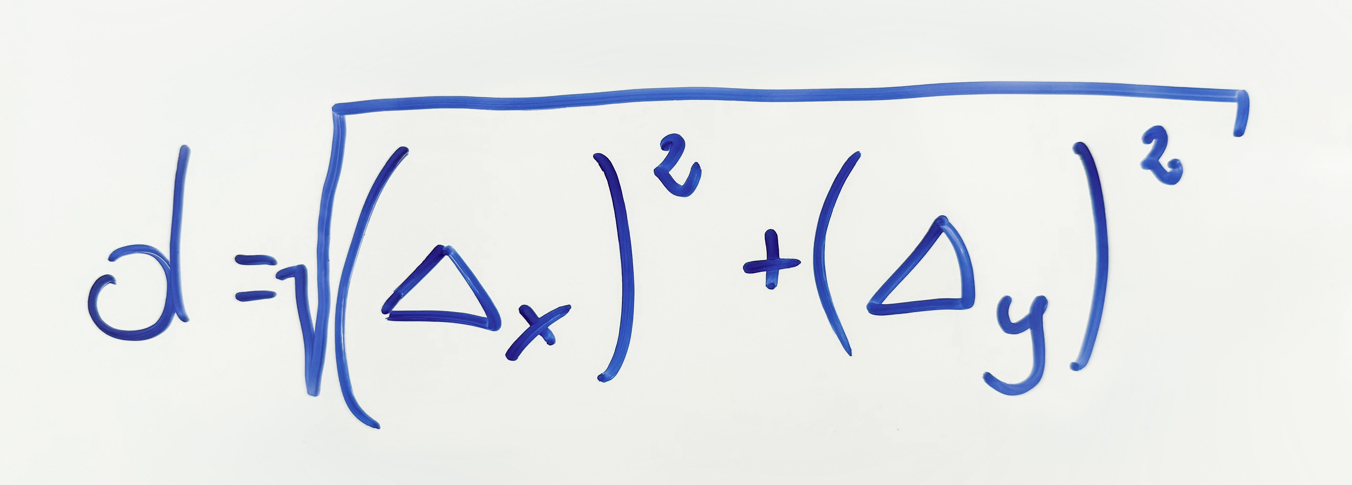
Then using the Pythagorean theorem we can calculate the length of the line itself.
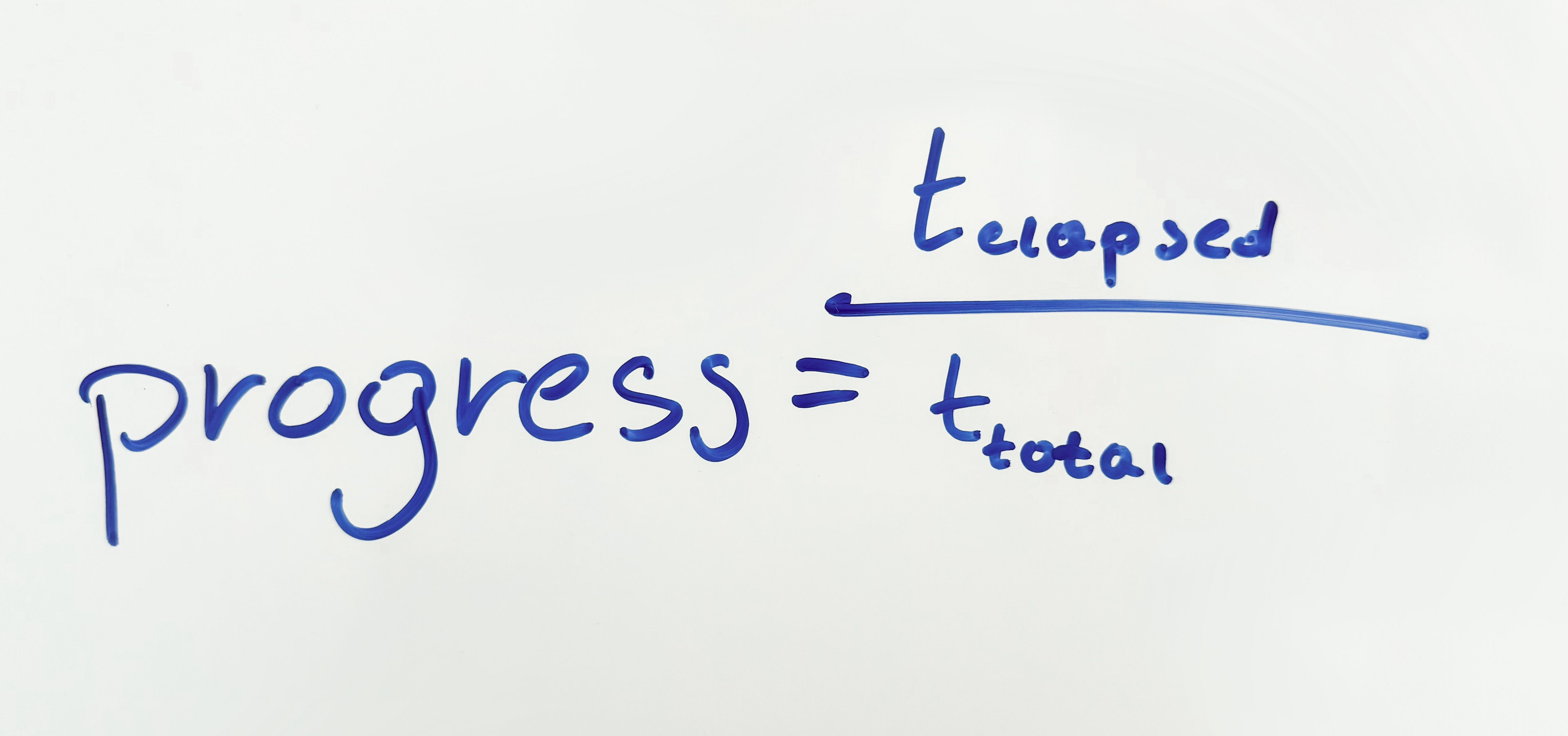
And knowing this, we can calculate the length of the line at the given time by simply multiplying it by the time that has passed (the progress).
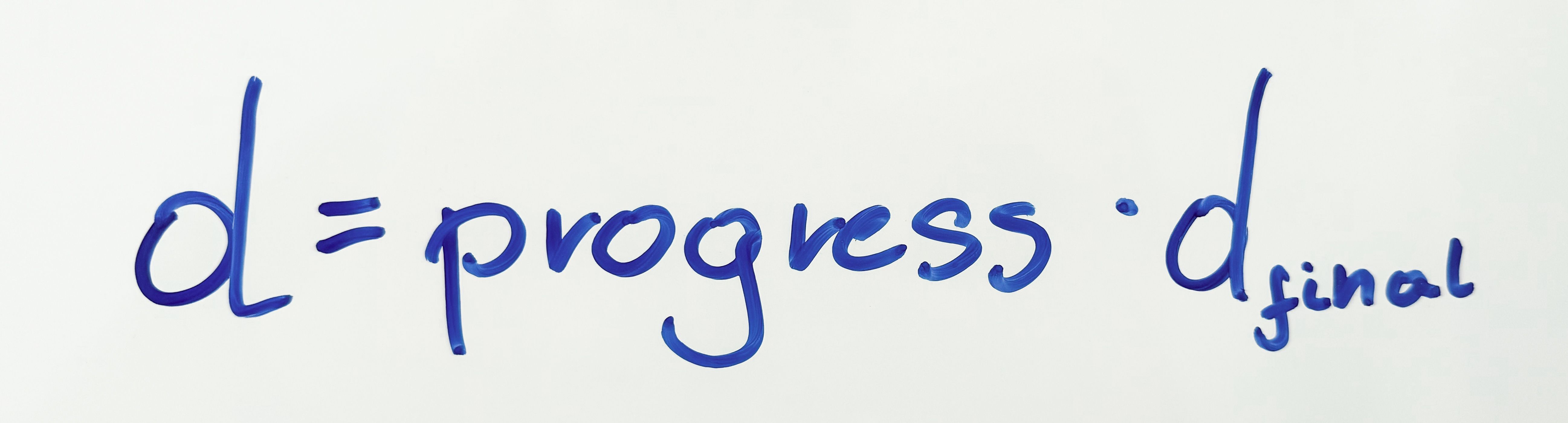
Now that we have the angle, starting point, the final length, and the progress we have to revert it back to a point so that we can draw the line between the starting point and the current end of the line.
ctx.moveTo(startX, startY)
ctx.lineTo(endX, endY)
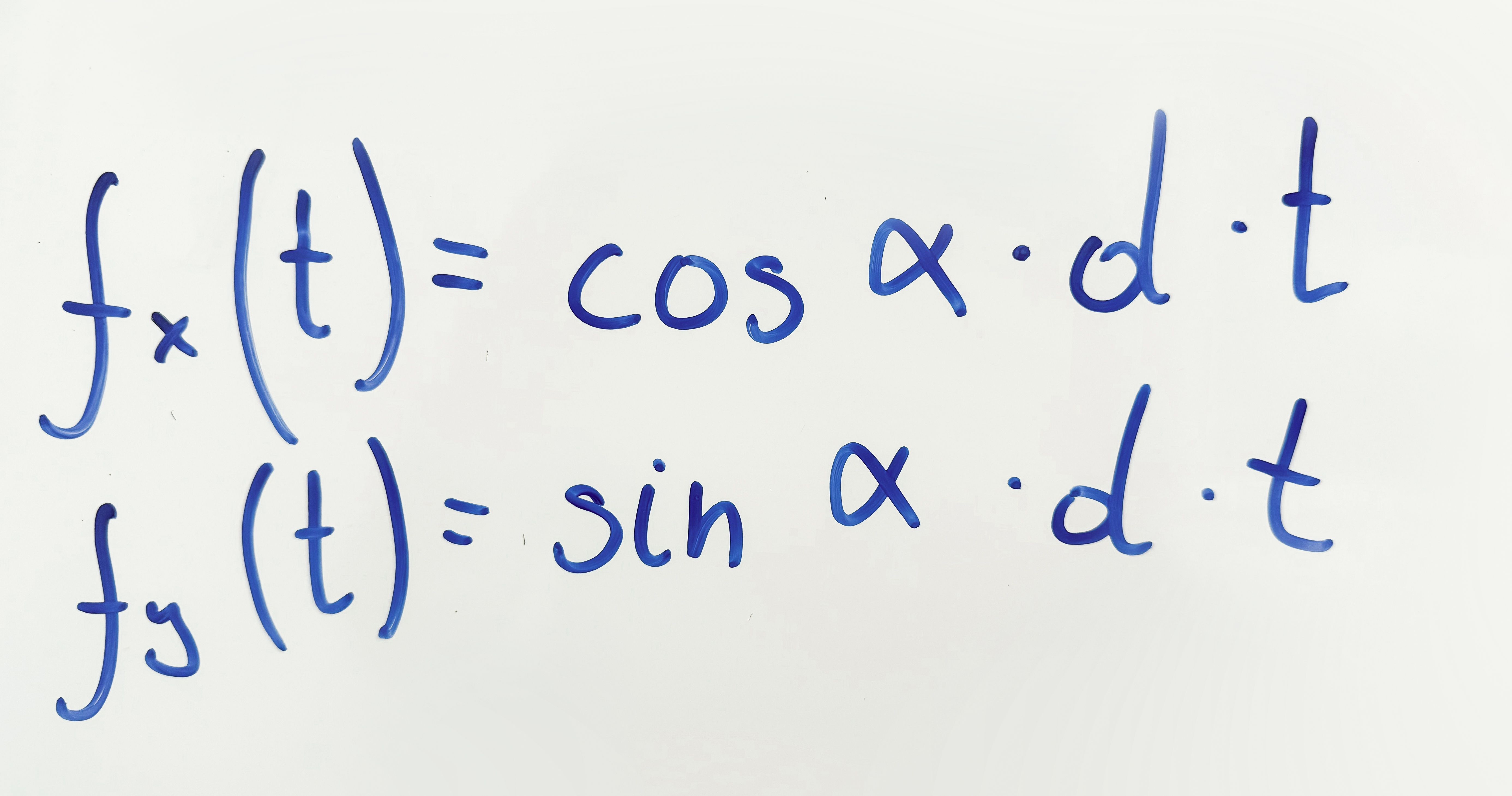
Trigonometry comes back to help us again. Using sine and cosine we can calculate the lengths of the adjacent (x) and the opposite (y).
 Piecing it all together
The final step was to combine all of the calculations from before:
- Clear the canvas.
- Calculate the angle & length of the lines at which they should be drawn.
- Calculate the time ratios.
- Draw the line #1 based on the value of
progress(value from 0 to 1). - Draw the line #2 based on the value of
progress(value from 0 to 1). - Wait till the next frame using
requestAnimationFrame. - Go back to 1 until finished.
function getLineInfo({ start, end }) {
  const dx = end.x - start.x
  const dy = end.y - start.y
  const angle = Math.atan2(dy, dx)
  const d = Math.sqrt(dx ** 2 + dy ** 2)
  return { d, angle }
}
function drawLine(ctx, line, angle, d, progress) {
  const { start } = line
  ctx.moveTo(start.x, start.y)
  const xd = Math.cos(angle) * d * progress
  const yd = Math.sin(angle) * d * progress
  ctx.lineTo(start.x + xd, start.y + yd)
}
function draw(progress, ctx) {
  ctx.clearRect(0, 0, ctx.canvas.width, ctx.canvas.height)
  const line1Info = getLineInfo(checkLine1)
  const line2Info = getLineInfo(checkLine2)
  const line1DurationRatio = line1Info.d / (line1Info.d + line2Info.d)
  const line2DurationRatio = line2Info.d / (line1Info.d + line2Info.d)
  const line1Progress = clampTo(progress / line1DurationRatio, 0, 1)
  const line2Progress = clampTo((progress - line1DurationRatio) / line2DurationRatio, 0, 1)
  ctx.beginPath()
  drawLine(ctx, checkLine1, line1Info.angle, line1Info.d, line1Progress)
  drawLine(ctx, checkLine2, line2Info.angle, line2Info.d, line2Progress)
  ctx.stroke()
}
function animate() {
  function frame(timestamp) {
    const dt = Math.min(duration, timestamp - animationStart)
    const progress = dt / duration
    draw(easingFunction(progress), ctx, icon)
    if (dt < duration) {
      requestAnimationFrame(frame)
    }
  }
  requestAnimationFrame(frame)
}
You can play around with the animation progress, points positions, and equation values in the interactive playground down below.
It's done!
And here we are, the animation is finished! After just a few additional tweaks later, we have ended up with a cross-platform, cross-browser implementation of the checkbox.
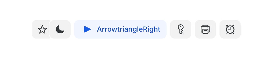
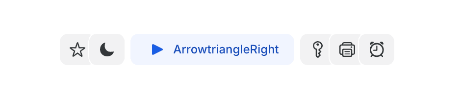
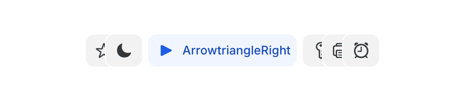
Button number two
![Apple - WWDC 2024 — June 10 Apple [RXeOiIDNNek - 1541x867 - 1h28m02s].png](/images/content/blog/going-the-extra-mile-bartek-18.png)
The previous WWDC was a blast for us. Not only did we get featured during the keynote, but we also got really inspired by a new component that Apple introduced in the mail app — something that we call Fluid Segmented Control.
![Apple - WWDC 2024 — June 10 Apple [RXeOiIDNNek - 1541x867 - 23m11s].png](/images/content/blog/going-the-extra-mile-bartek-19.png)
Getting inspired is a crucial part of the creative work. We love getting inspired. Especially from the best out there!
As we had already started working on tweaking some of the elements in our sidebar, it looked perfect for our use case. Daniela Muntian — one of our designers — recreated it in Figma and briefly explained how it should work.
When one of the elements is selected, it should push the others away to make space for it.
Seemed straightforward — really wasn't.
What does push away mean?
One of the first challenges was to figure out how the elements should move when you change the selected tab.
If there was a lot of space available, then it was easy — make the non-selected elements as small as possible, and fill the rest of the space with the selected one.
Where it got harder was when it didn't have enough space to fit the full selected element and all of the icon elements at the same time.
The solution was to actively calculate the width of the container of the whole component, and then also calculate the width of each of the individual elements inside.
Based on those calculations, we see if the elements would fit. If they don't, we make the elements on the left side overlap each other by a specified amount (in our case it's 8 pixels).
They still don't fit? Then make the elements on the right overlap.
Still not enough space? We start calculating the amount of space that we are lacking. Then we distribute the amount to all of the elements around, so that they overlap each other even more.
However, if there still is not enough space to make the icons visible while the elements are overlapping, we allow the selected element to contract, and make the text be cut off with an ellipsis.

Here you can see all of it in action!
Handling diverse use cases
Defining how it should behave is one thing. Making it actually work… is a different story. As this is a component built into our component library, we need to make it work for every case — screen sizes, resolutions, DPIs — but also for different usages — with icons, without icons, maybe even with some custom icons that don't fit into a normal 1:1 aspect ratio.
So to be able to calculate the widths properly we have to first calculate the elements. We go through each element and get its icon's width, text's width and the gaps between them. Based on this we can get all of the combinations of the sizes — with and without an icon.
Handling text truncation
One of the finishing touches that I wanted to do is the cutting of the text using an ellipsis. It sounds easy, and was easy — if you apply text-overflow: ellipsis and overflow: hidden to an element, it will automatically apply it for you in case the element is too small.
However, this approach was problematic during the animation of the element becoming selected. There would be a brief flash of … which was really eye-catching and wasn't a desired effect.
To combat this, I've applied the text-overflow only for the elements that really needed it — the selected elements that wouldn't fit even if we applied overflow to the elements around.
Perfecting the overlap appearance
But the biggest issue by far came last. As you can see, when the elements overlap, the space between them should be cut out and have the background see-through.
At first, I implemented it using a simple white border around the elements. It looked good while still in Storybook, but when used in the app… it looked off as we don't use a solid background everywhere.
Fortunately, the clip-path property comes to the rescue. It gives us an option to apply a clipping mask to an element. The hard part was how to create the clipping mask as it's not using CSS properties but requires us to create an SVG path.
The clip-path property allows us to define a clipping region that determines which parts of an element are visible. This is particularly useful for creating complex shapes and effects that are not possible with simple CSS properties.
Small intro to the SVG paths
When you have a look at the path definition when it's exported from tools like Figma or Adobe Illustrator, they might look super scary.
<path
  d="
    M14.581 3
    c1.527 0 2.885.957 3.384 2.368
    a.582.582 0 0 1-.369.75.595.595 0 0 1-.759-.355 2.392 2.392 0 0 0-2.086-1.579
    H6.594
    c-1.278 0-2.316.967-2.396 2.2
    v8.063
    c0 1.254.978 2.28 2.226 2.359
    l.17.01
    h7.987
    a2.401 2.401 0 0 0 2.256-1.58.587.587 0 0 1 .76-.354
    c.319.108.478.444.368.75
    a3.601 3.601 0 0 1-3.194 2.358
    l-.19.01
    H6.594
    C4.667 18 3.1 16.51 3 14.635
    V6.553
    C3 4.648 4.498 3.099 6.394 3
    h8.187
    Z
  "
  fill="#000"
/>
They are however just a list of basic instructions:
- Move to:
M/m(ABSOLUTE / relative) - Line to:
L/l - Horizontal line to:
H/h - Vertical line to:
V/v - Cubic Bézier curve to:
C/c - Smooth cubic Bézier curve to:
S/s - Quadratic Bézier curve to:
Q/q - Smooth quadratic Bézier curve to:
T/t - Arc to:
A/a - Close path:
Z/z
To make it easier to read and build such paths, I've created a simple helper class to be able to use human-readable commands.
class ClipPath {
  commands: string[] = []

  absoluteMoveTo(x: number, y: number) {
    this.commands.push(`M ${x} ${y}`)
    return this
  }

  relativeMoveTo(x: number, y: number) {
    this.commands.push(`m ${x} ${y}`)
    return this
  }

  // ...

  closePath() {
    this.commands.push('Z')
    return this
  }

  build() {
    return this.commands.join(' ')
  }
}
Then it was just a matter of figuring out what steps should we make to create the proper mask.
function buildPath(borderRadius: number, fullyVisibleWidth: number, height: number) {
  return ClipPath.start()
    .absoluteMoveTo(0, 0) // (1)
    .absoluteHorizontalLineTo(fullyVisibleWidth) // (2)
    .relativeHorizontalLineTo(borderRadius) // (3)
    .relativeQuadraticCurveTo(-borderRadius, 0, -borderRadius, borderRadius) // (4)
    .absoluteVerticalLineTo(height - borderRadius) // (5)
    .relativeQuadraticCurveTo(0, borderRadius, borderRadius, borderRadius) // (6)
    .absoluteHorizontalLineTo(0) // (7)
    .absoluteLineTo(0, 0) // (8)

    .closePath()
    .build()
}
This would result in something similar to this:
M 0 0
H 30
h 10
q -10 0 -10 10
V 24
q 0 10 10 10
H 0
L 0 0
Z
Having built this, using the clip-path property we can apply the mask on the elements that are overlapping. It presents us with a nice effect of the see-through background. It also allows the elements to be slightly transparent to allow blending their colors with the background.

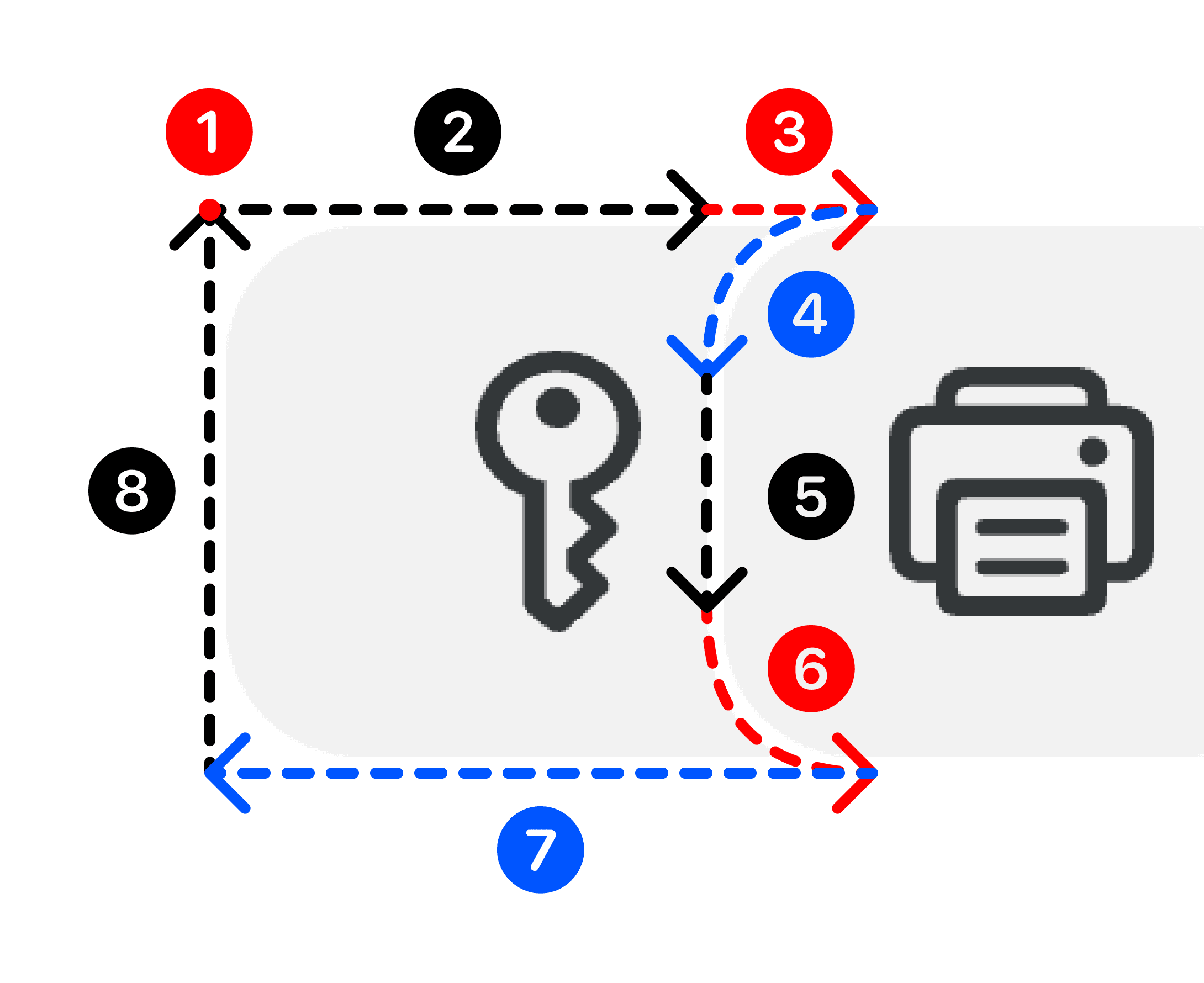
All of this for what?
Will all users see the difference? — Probably not. Was it worth it? — Absolutely. These are the minor details that often go unnoticed when present, but become conspicuous when missing.
We strive for having as many of those details as possible, making the experience great but at the same time — seamless.